
Local-only web apps
Over the last few months I've created a handful of local-only web apps for my own use and for family members. They're designed for somewhat specific needs that only occasionally arise, but those needs supplied an excuse to play more seriously with Christian Johansen's suite of ClojureScript libraries, namely Replicant, Portfolio, Nexus, m1p, Lookup, and Dataspex, which I appreciate for their focus on data-driven frontend development. Each of the apps runs entirely in the browser. Chrome has a file system API, but not everyone uses Chrome (including me), so to persist data the apps save to and load from the browser's local storage, as well as providing buttons to download a file and copy data to the system clipboard, both of which export YAML. To load the data, you can import a YAML file.
None of the apps are polished, nor bulletproof. I made them to learn, not just about a set of ClojureScript libraries but also about new developments in web technologies. Consider them scrappy fiddles. If you find any of them useful, let me know, and certainly report any bugs.
Here's a quick rundown of each app.
Tinycal
This is the fourth iteration of this tiny calendar. The first implementation is lost to time, but the second version (which I covered a few years ago) recreated it and just showed one year from beginning to end with buttons to export it to SVG or PNG. The third iteration let you configure the start date, end date, what day of the week to start on, which dates to show, and provided a print option. Those versions now redirect to the latest take.
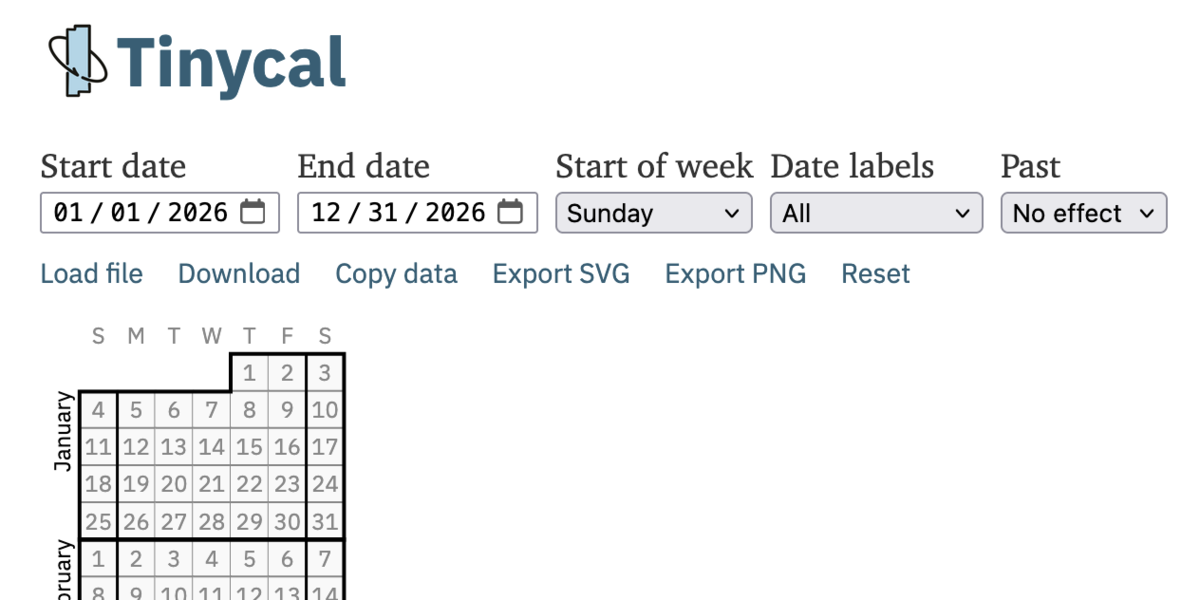
The new version I built because my brother uses the exported PNG in an image editor to outline his plans for the year ahead, and I realized I could make that at least a little easier. Now Tinycal allows selecting dates and highlighting them in one of several colors. You can also add a note that labels events to the right of the calendar.
It's still a tiny calendar, so it gets crowded fast if you try to use it for scheduling, but I like it less for seeing the day-to-day obligations and more for mapping the broad strokes of the coming months, especially for seeing what weekends I have free. To help with that, the app can be saved to your phone's home screen and run as a progressive web app.
Conflict resolution diagrammer
Years ago I made a web-based diagrammer for conflict resolution diagrams, but I was never totally happy with it. Revisiting it recently to explore some tensions at work, I was pleasantly surprised to learn that CSS now has a grid layout that you can template using an ASCII diagram. That made it a lot easier to handle a more two-dimensional layout.
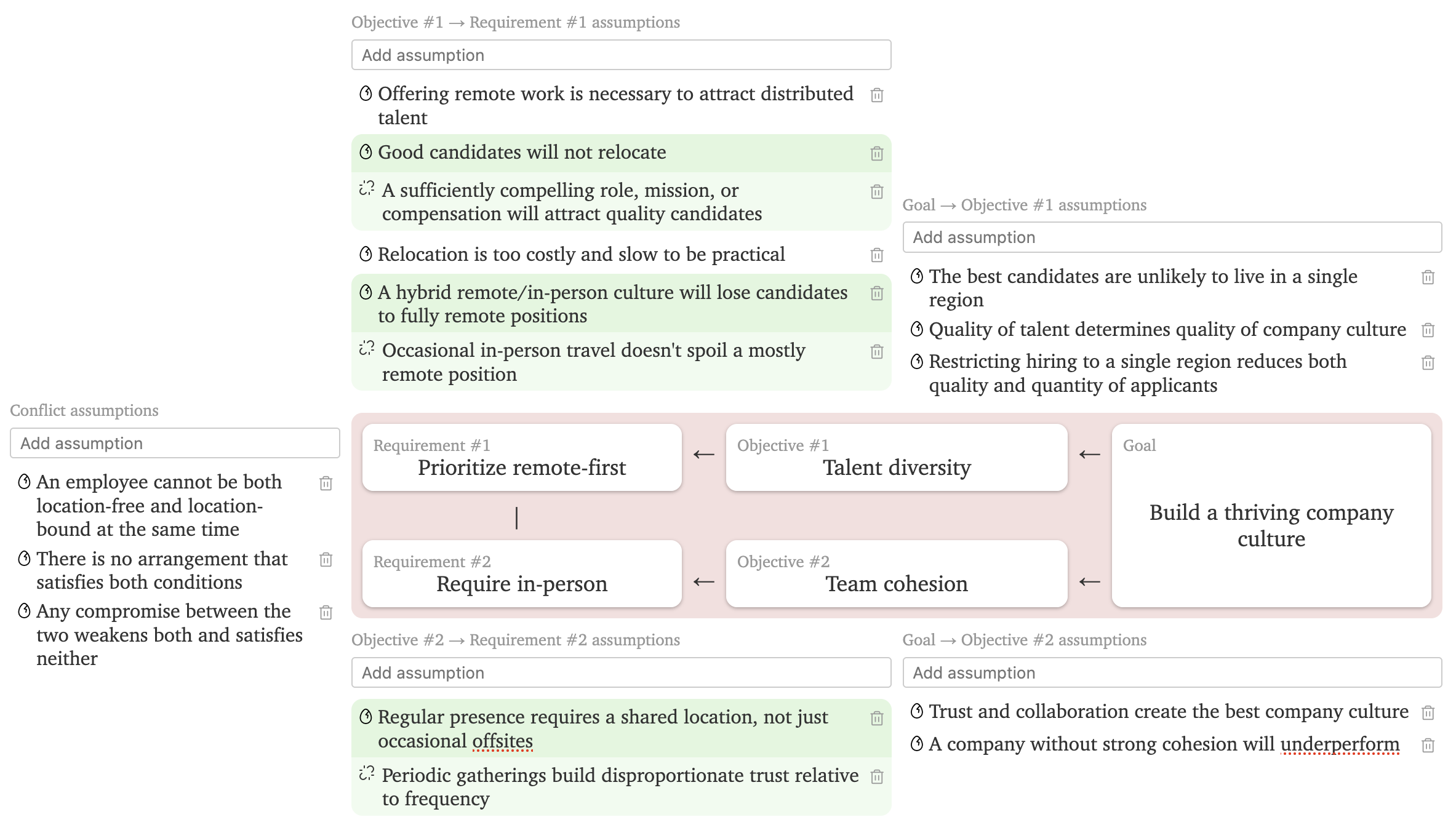
Most people aren't familiar with a conflict resolution diagram, so I added some documentation below the app to explain how to use it. It's easy to miss when you land on the page, so if you have design tips to improve it, send them my way.
QuizBoard
The very first real software I made was a pared-down version of Jeopardy! for a kids' study group. I implemented it in Visual Basic in junior high school and called it "Answers & Questions". It loaded categories and questions from a text file. The layout was hard-coded to an 800x600 screen resolution, so every time it was used on a higher resolution monitor, the computer's screen size had to be changed for the game to fill the screen. Eventually I made a version that scaled to screen resolution, but by then I didn't need the game and the rewrite was mostly a learning exercise.
A couple months ago I was asked for a new version, which I dubbed "QuizBoard". While Answers & Questions followed a strict Jeopardy! layout of six categories with five questions each, QuizBoard allows any number of categories, each category can have any number of questions, and each question can have multiple clues. At first I required a game to be made by editing the downloaded YAML file and re-uploading it, but that proved both cumbersome and error-prone, so I added a simple game editor.
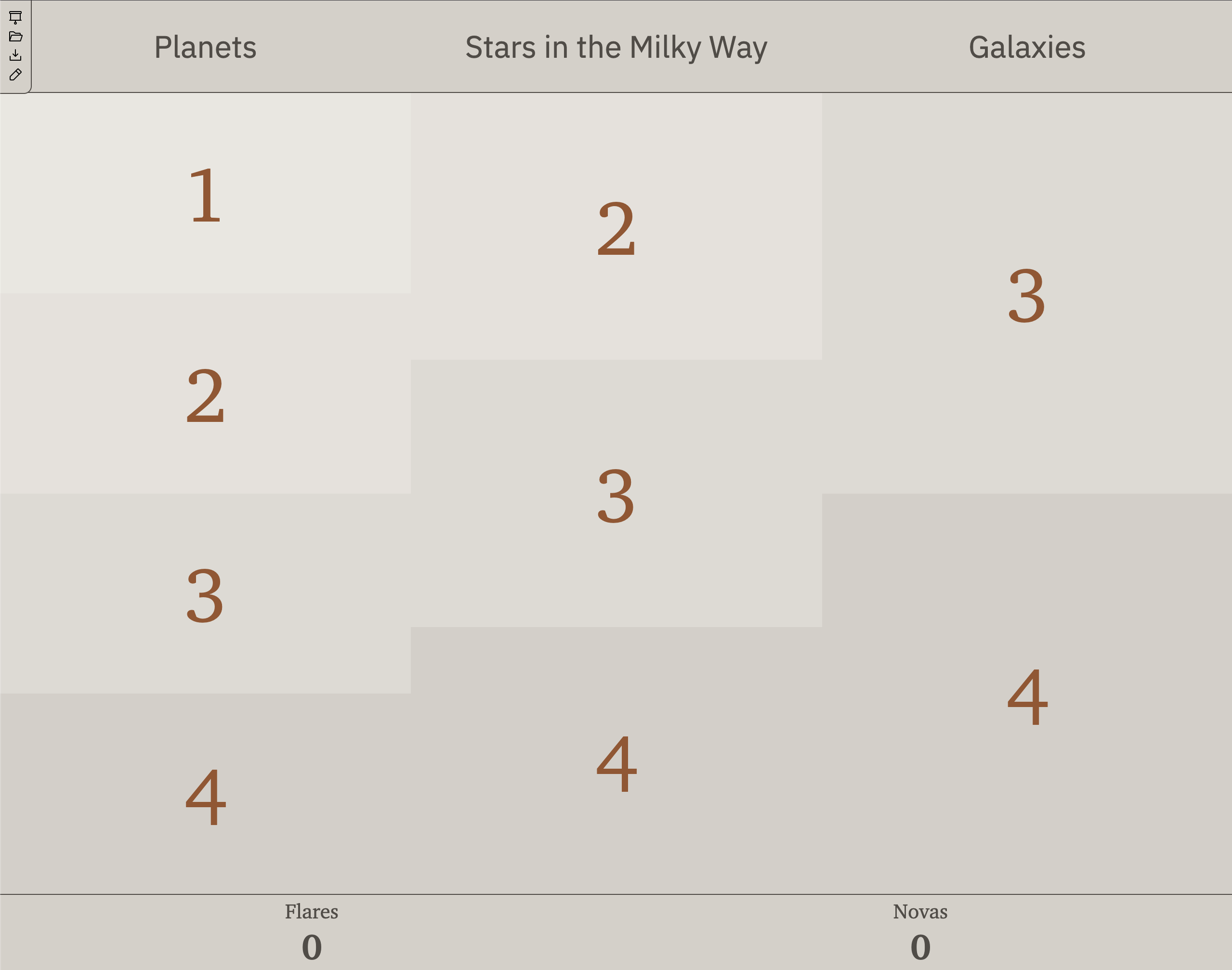
I also added a presentation mode. Launching it opens a new window that can be shown on an external monitor and controlled from the original window. That gives the operator a chance to see all the clues on a question, as well as the answer, so they can decide if a team got the right answer.
Causation
In high school, I had to make a cause and effect diagram of the American Civil War, and I got carried away, spreading it onto multiple sheets of printer paper that I taped together into a poster. In college, I made diagrams for some of the European periods covered in freshman history, and when my classmates saw them, they asked for copies to study from. Probably if I had learned to make such diagrams sooner, I would have been interested in history sooner. I've also drawn cause and effect diagrams to explore complex systems.
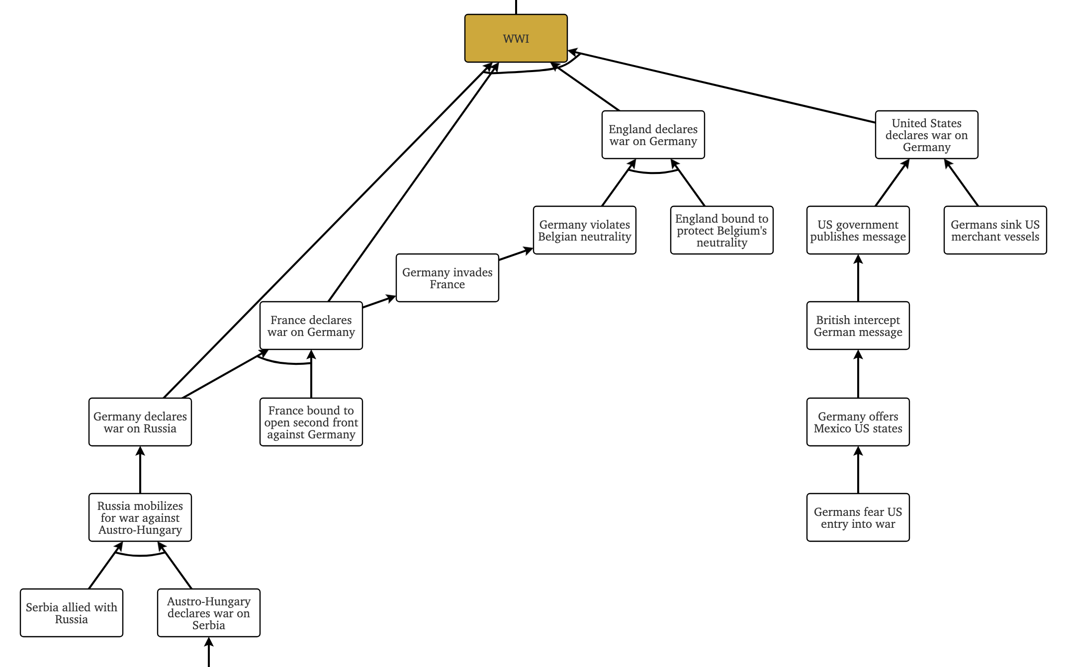
Since college, I've tried a few different graphing tools for making cause and effect diagrams, but I haven't found any I've liked. Graphviz and Mermaid are text-based and easy to lose my place in. Excalidraw is more visual and manual, and arrows stay connected to boxes, but when drawing a current reality tree) I want to link edges together to denote multiple conditions that need to be true to produce an effect, and Excalidraw doesn't offer that without jumping through hoops like intermediate nodes.
I finally sat down to make something suited to my usage. It snaps nodes to a coarse grid, doesn't require drawing arrows manually, allows inserting nodes in the middle of existing links, and most importantly, lets you link edges to each other. My favorite feature is being able to move whole subgraphs, dragging all of a node's descendants or ancestors with it to make more room.
Home Electric Cost Optimizer
My father has a hybrid vehicle and was curious if he got solar panels whether he should charge the car with surplus solar power during the day or use cheaper rates from the grid at night and sell surplus solar power back to the grid. I made this calculator to explore possibilities.
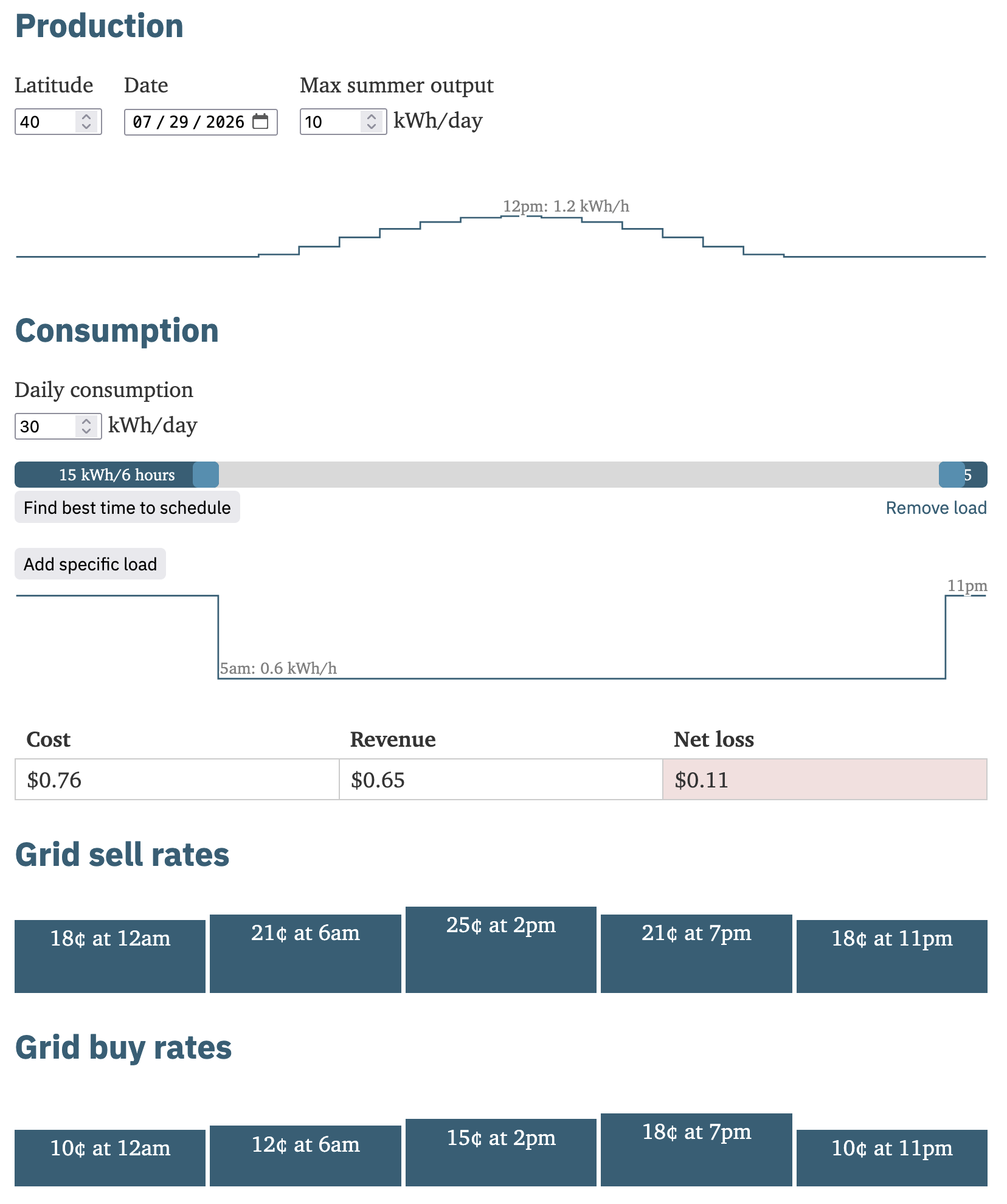
There are a lot of factors in the conversion of solar irradiance to actual power output. Latitude is the main one, but it's also affected by your local climate's tendency toward cloudiness, the efficiency of the panels, the direction the panels face, and their angle. I simplified all of that by asking for max power output on the summer solstice, then scaling solar irradiance to produce that.
Making it for someone other than myself meant more back and forth communication with a "customer". The physicist in me desperately wanted to reduce units like kilowatt-hours per hour to just kilowatts, but to a layman looking at his electric bills that was less intuitive than kWh/h.
Timeliner
Another history-related project is Timeliner, which I started because I frequently find myself either surprised by how far apart different events were or how unrelated events happened at the same time. For example, I tend to forget Mozart lived during the American Revolution. To gain a better perspective, I wanted a timeline visualization tool that let me add arbitrary historical events and zoom and scroll horizontally. Probably there's a good tool for this, but I forgot to look.
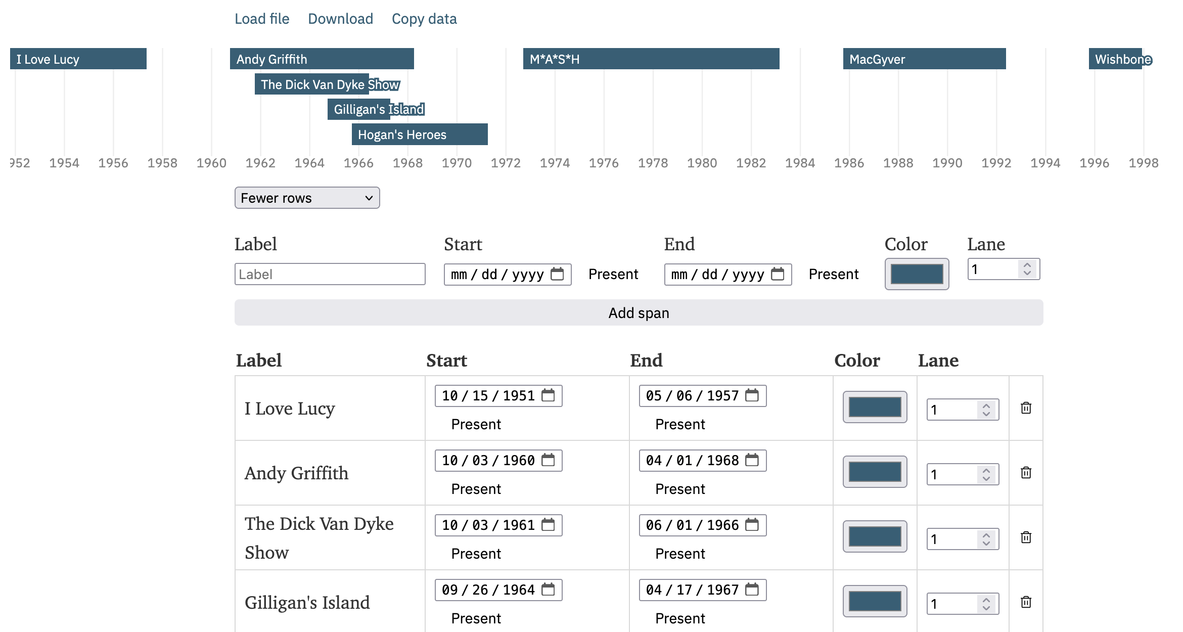
Making it, I discovered there's a native HTML color element, and while the Mac color picker lets you define swatches, it pops up a new window that can lose focus to the original window, which for me caused some odd behavior.